
WeDiscover
Building an identity from nothing.
WeDiscover did not come to us with a brand problem. They came without a brand at all. There was no name, no language, and no visual system to stand behind. Only intent. Before design could begin, the identity had to exist.
-
WeDiscover was founded on a clear ambition to help people find what they were looking for, whether that meant knowledge, direction, or opportunity.
The founding team brought deep strategic experience, but externally there was nothing to reflect that clarity. No way to communicate intent. No structure to hold meaning as the business evolved.
This was not a case of refining what already existed. It was about defining something from the ground up.
-
The challenge was not differentiation. It was legitimacy.
In a crowded, credibility-driven space, a weak or trend-led identity would have positioned WeDiscover as another consultancy with opinions, not conviction.
Without a clear identity, the business risked being overlooked before it was even understood.
This was not about launch. It was about foundation.
-
We do not begin with visuals. We begin with identity.
The early work focused on understanding what WeDiscover needed to stand for before deciding how it should look. What it could credibly promise. What it should refuse to perform. What kind of presence would feel honest rather than impressive.
This stage was about removing noise, not adding direction.
From understanding came structure.
From structure came language.
From language came form.
Naming
The name WeDiscover wasn’t invented. It was revealed by the work.
It reflects curiosity over certainty and collaboration over authority. Discovery as an ongoing act rather than a finished outcome.
The name is intentionally open. It allows the brand to grow without losing meaning, and to evolve without needing to reinvent itself.

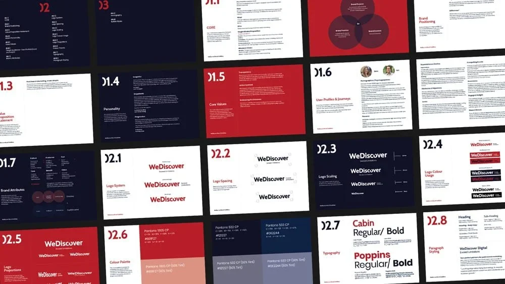
Identity system
The visual identity was designed to feel calm, clear, and assured.
The broken “o” in the logotype represents the missing piece, the moment of insight, the thing yet to be found. It also introduces a sense of motion and progress, reflecting the digital environments the brand operates within.
Every element of the system exists to support clarity and trust, not decoration.

Expression
Colour, type, and rhythm were chosen to reinforce focus rather than distraction.
Red anchors energy and intent.
White provides space and honesty.
Blue supports trust and stability.
Together, the system balances momentum with restraint, allowing complex thinking to breathe and ideas to land without noise.
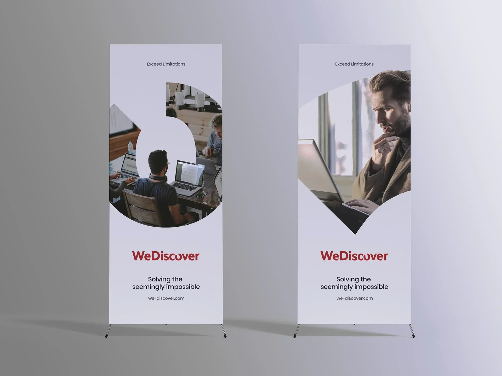
Outcome
The result is not a visual refresh.
It is a working identity.
A foundation designed to scale with the product, align teams internally, and earn trust externally over time.
The brand feels confident without performance, human without softness, and intentional without rigidity.
Reflection
WeDiscover is a clear expression of how Unnamed approaches identity.
We work at the point where things are still unresolved, unnamed, and uncertain. We take responsibility for defining what a brand can stand behind before it ever needs to perform.
Identity before aesthetics.
Clarity before visibility.
Human perspective
“The process of creating, designing, and launching the brand with Unnamed was well organised, with every milestone delivered on time and the quality of work consistently high. The team showed a genuine interest in our business, which made the collaboration feel considered and easy throughout.”
Byron Tassoni-Resch
Founder, WeDiscover