

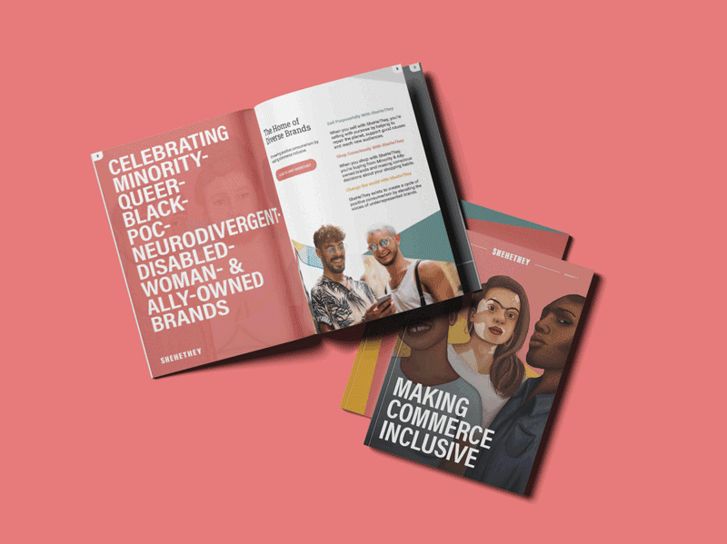
SheHeThey
Designing a home for diverse brands.
An inclusive commerce platform built on the belief that buying power can create cultural change. Unnamed defined its identity from the ground up - strategy, language, and visuals - so the brand could hold difference without dilution.
-
SheHeThey was created to challenge the norms of mainstream retail.
While many platforms spoke about diversity, few were structurally designed to support it. SheHeThey needed to serve multiple founders, audiences, and perspectives without collapsing into visual or narrative noise.
This was not a single-brand identity. It was a platform identity, one that needed to remain open, adaptable, and coherent as it grew.
-
The challenge was balance.
SheHeThey needed to feel optimistic without being naïve, bold without becoming chaotic, and inclusive without losing clarity. The brand had to support difference while still feeling unified and credible as a commercial platform.
Every decision had to work at scale, across products, people, and stories that were intentionally diverse.
-
We began by defining what the brand needed to do, not how it should look.
The early work focused on language, values, and structure. We clarified the role the brand needed to play, the behaviours it needed to encourage, and the boundaries it needed to hold.
This stage was about creating a framework strong enough to support many voices without flattening them into sameness.
From understanding came structure.
From structure came language.
From language came form.
Naming
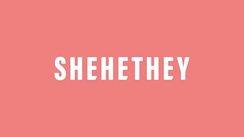
The name SheHeThey expresses inclusion without explanation.
It reflects fluid identity, shared humanity, and collective progress. The name is intentionally open, allowing the brand to grow without losing meaning or becoming fixed in time.
It invites participation rather than instruction.
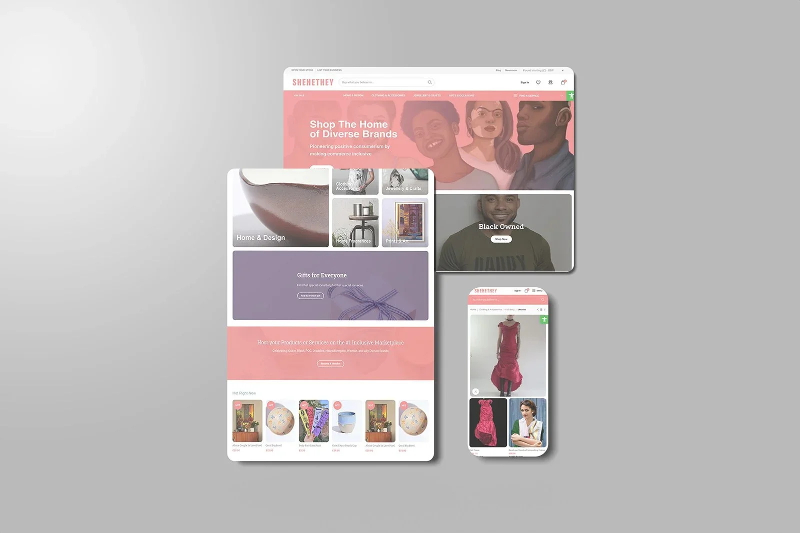
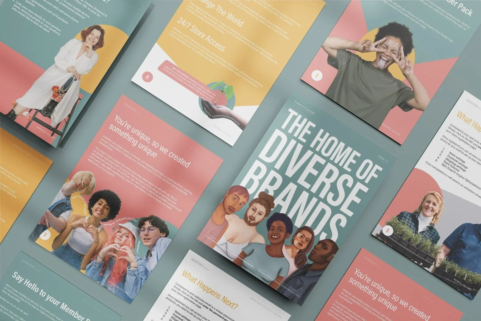
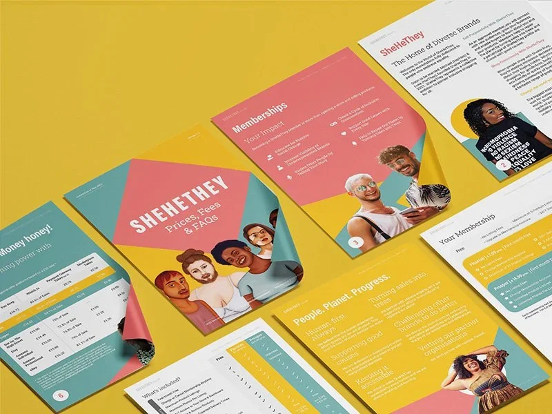
Identity system
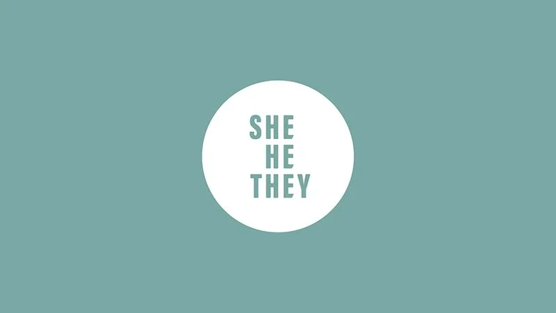
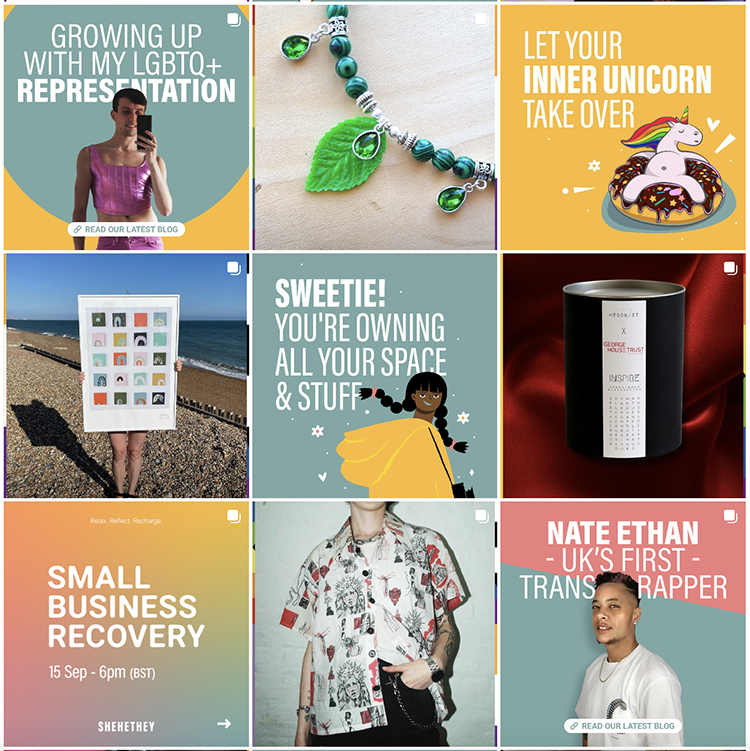
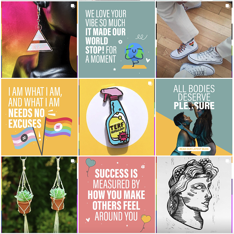
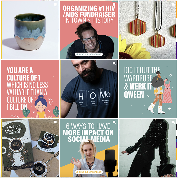
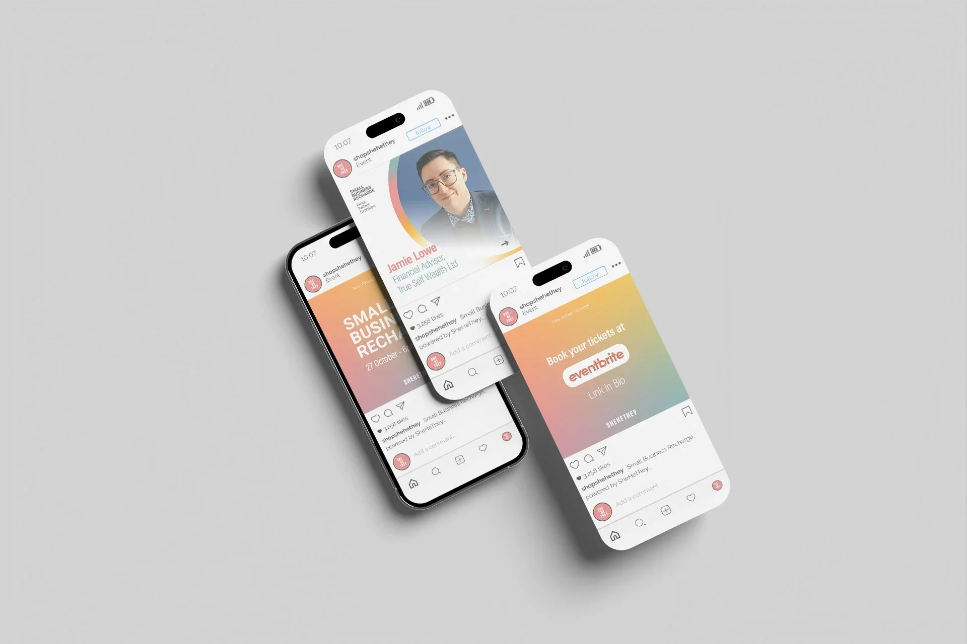
The visual identity was designed to feel clear, optimistic, and accessible.
A bold, stacked wordmark anchors the system, with generous spacing to ensure legibility and accessibility across sizes and contexts. The structure supports consistency while allowing flexibility for diverse applications.
Every element exists to support recognition, trust, and ease of use, not decoration.

Expression
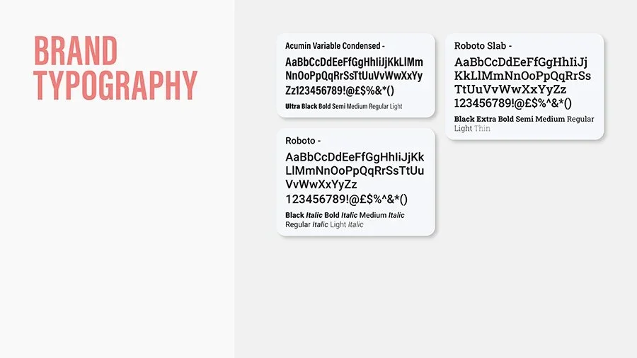
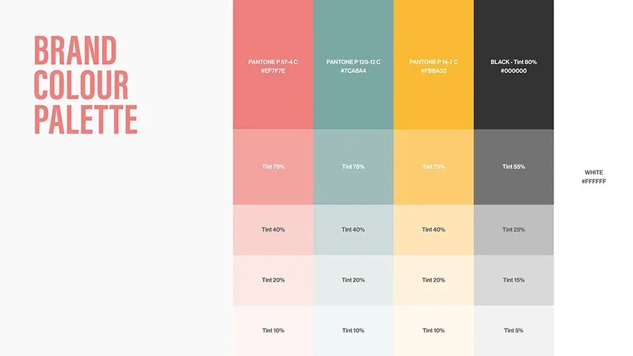
Colour, type, and rhythm were chosen to reinforce openness and momentum.
Bright primary colours express optimism, action, and visibility. Typography balances clarity with personality, ensuring the brand remains readable, modern, and human across platforms.
The system is energetic without being overwhelming, allowing multiple voices to coexist without visual conflict.
Outcome
The result is not a static brand.
It is a working identity designed to scale with the platform, support underrepresented founders, and adapt as the community grows. The system enables SheHeThey to communicate with clarity while holding difference at its core.
The brand feels welcoming without being passive, and purposeful without being rigid.
Reflection
SheHeThey is a clear expression of how Unnamed approaches identity at a platform level.
We work where complexity is real, audiences are multiple, and values must be translated into systems rather than statements. The work prioritises structure before aesthetics, and clarity before visibility.
Identity before decoration.
Structure before scale.
What people say
“A very special creation
Bought a product which supports the fight in ending stigma and discrimination against HIV and AIDS from a seller who is very passionate about supporting this cause, as I am myself and also this is visible that SheHeThey are passionate about this too. Great to see a marketplace that isnt focused just on sales, they truly demonstrate they live by their values and focus on people rather than profit ❤️”
Katy, Manchester
“SheHeThey is more than a marketplace
I used them to purchase products as well as selling products on their platform. They're concerned with diversity, inclusivity and the environment. With shehethey, you receive the personal touch as well as free marketing for your products, business recharge sessions to provide a better understanding of how to improve your small business. They provide 3 selling options and support with setting up your page and advice on all aspects of the platform. They answer queries swiftly and have made my experience as a customer and seller a thoroughly excellent one.”
Laley, Newcastle-upon-Tyne