
Big Yellow Sun
Translating strategy into presence.
Big Yellow Sun is the strategic practice of Jonathan Staines, working at the intersection of leadership, change, and long-term thinking. Unnamed translated the depth of the work into an identity that feels calm, credible, and lived in.
-
Big Yellow Sun was already grounded in years of strategic practice.
Jonathan’s work spans leadership teams, founders, and organisations navigating complexity. What existed was substance. What was missing was a visual presence that reflected the pace, tone, and integrity of the work itself.
The identity needed to support conversation, trust, and reflection, rather than performance or persuasion.
-
The challenge was expression without simplification.
How do you visualise depth without making it feel academic?
How do you create warmth without becoming soft?
How do you show confidence without turning insight into spectacle?
The risk was over-design. Any identity that tried to impress would undermine the work it was meant to support.
-
We began by observing rather than inventing.
The work already had a voice. Our role was to listen closely to how it moved, how it unfolded, and how people experienced it in conversation. From there, we defined the role the identity needed to play.
Not to lead.
Not to explain.
But to hold space.
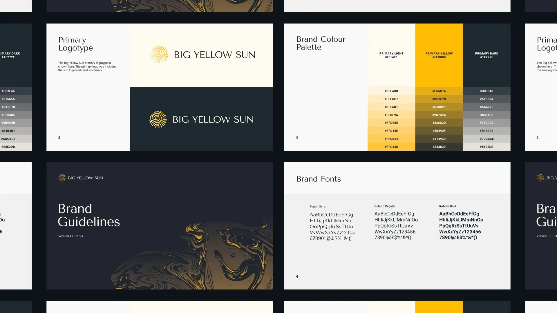
Identity system
The visual system is composed, minimal, and human.
Organic forms reference thought in motion rather than fixed conclusions. Colour is used sparingly, grounding the work while allowing warmth to surface naturally. White space is treated as an active element, giving ideas room to land.
Every component exists to support clarity, not decoration.
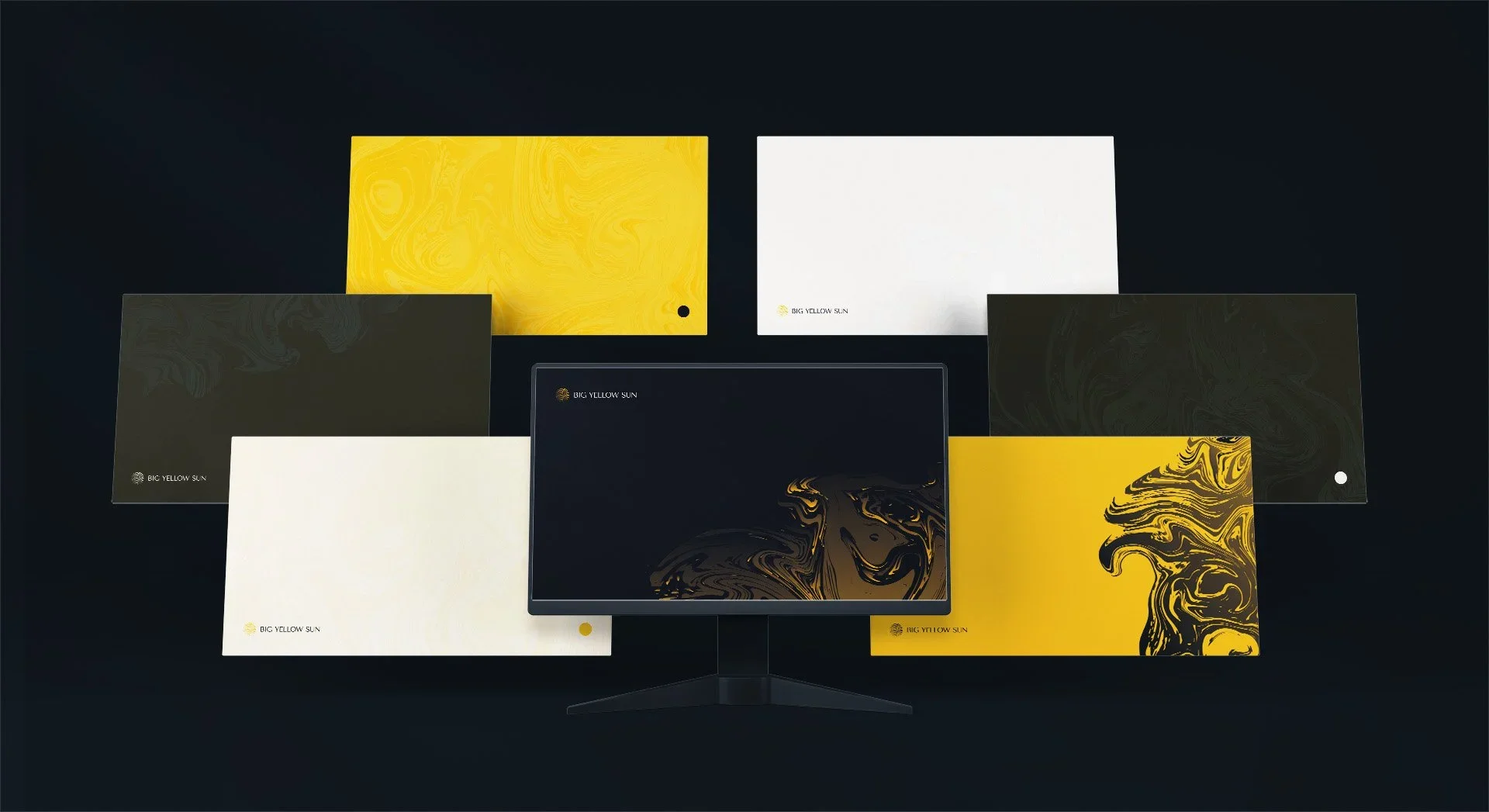
Expression
The identity is designed to feel consistent across touchpoints without becoming rigid.
Typography prioritises readability and rhythm. Colour introduces calm energy rather than stimulation. The system adapts quietly across digital and written formats, ensuring the work remains the focus.
Nothing competes. Nothing shouts.
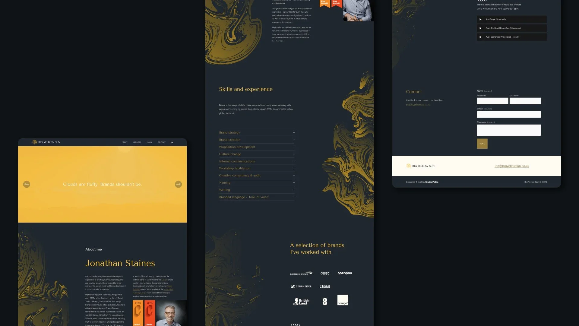
Outcome
The result is not a campaign or a refresh.
It is a presence that reflects the way Big Yellow Sun works in the world. One that supports long-term thinking, builds trust over time, and allows conversation to unfold without interruption.
The identity gives form to the work without defining it.
Reflection
Big Yellow Sun reflects how Unnamed works with experienced practitioners.
We do not add noise to depth. We create the conditions for it to be felt. The work prioritises restraint, clarity, and respect for what already exists.
Identity before aesthetics.
Clarity before visibility.
Human perspective
“The process of creating my brand and website felt patient and considered throughout. The team listened carefully, offered constructive guidance, and produced strong results.”
Jonathan Staines
Founder, Big Yellow Sun