
The Usual
A conceptual café brand identity exploration
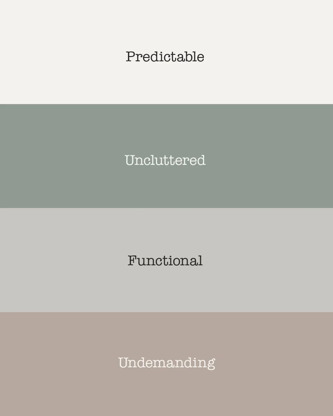
The Usual is a conceptual brand identity exploration created to examine how restraint, predictability, and familiarity can operate as value in neighbourhood café branding.

Name: The Usual
Logo:
-
Most cafés are designed to be noticed.
They rely on novelty, stimulation, and rotation. Menus change to create interest. Interiors compete for attention. Identity is built to be photographed, shared, and refreshed. Familiarity is treated as stagnation. Predictability is treated as failure.
This approach assumes people want more. More choice. More energy. More personality. More reasons to engage.
In many neighbourhood settings, this logic has become the default.
-
When cafés optimise for stimulation, they lose the qualities that make them dependable.
Constant novelty introduces friction. Menus require attention. Interiors demand interpretation. Brand language asks to be understood. Even routine visits become moments of decision rather than habit.
Over time, this changes the role of the café. It stops functioning as a stable point in daily life and becomes another interchangeable experience competing for attention.
For regulars, this creates fatigue instead of attachment. The space no longer reduces effort. It increases it.
In neighbourhood contexts, where repetition and recognition matter most, overstimulation becomes a design failure rather than a feature.
-
I wanted to test a different assumption.
That restraint, predictability, and familiarity could be treated as value rather than risk. That a café designed to feel ordinary might become more meaningful over time, not less.
The hypothesis was simple. If a place removes the need to choose, perform, and respond, people may return to it more often. If identity is inherited rather than invented, trust may build faster than attention ever could.
The risk was obvious. Without novelty, the brand could be overlooked. Without stimulation, it could be dismissed as boring. Without performance, it could fail to register at all.
This exploration accepts that risk.
-
The name was not designed. It was selected.
“The usual” is inherited language. It signals routine, recognition, and shared understanding. It is culturally understood without explanation. It implies memory without sentiment.
Psychologically, “the usual” removes effort. It replaces choice with expectation. It suggests that someone knows you well enough not to ask.
As a name, it refuses distinction. It does not promise experience, craft, or innovation. It signals continuity instead.
That refusal is the point.
-
This exploration began by removing things rather than adding them.
No loud music.
No screens.
No seasonal rebrands.
No rotating concepts.
No campaign language.Instead of designing moments, the focus shifted to behaviour. How the space would be entered. How orders would be taken. How often decisions were required. How predictable each interaction could become.
Continuity replaced novelty.
Ritual replaced campaign.
Recognition replaced engagement.The café is not designed to surprise. It is designed to remember.
-
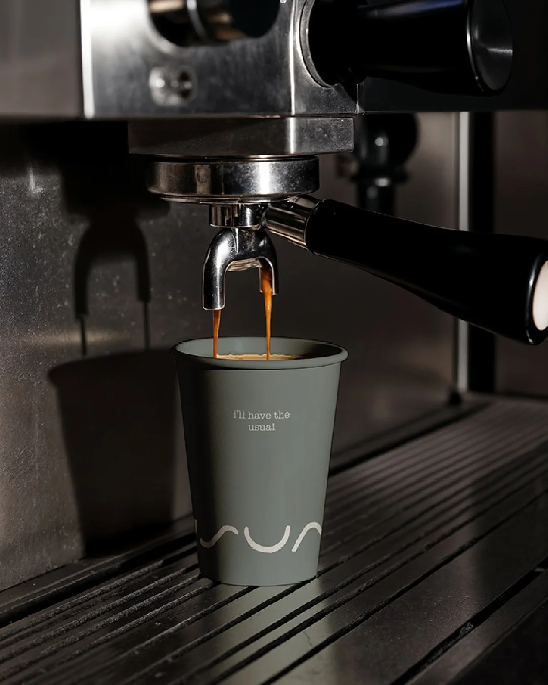
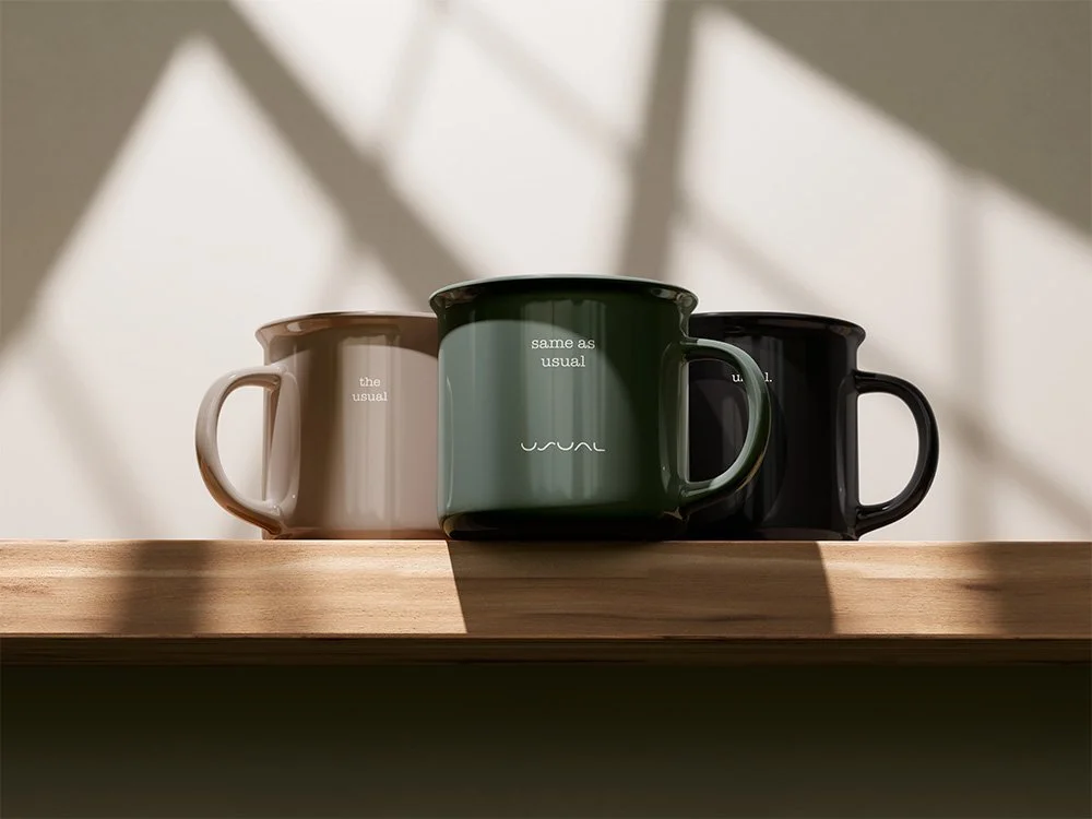
The logo was treated as a behavioural cue rather than a brand signature.
Instead of using the name as the primary identifier, the mark abstracts the idea of “the usual” into a repeated, continuous gesture. The form is neither illustrative nor symbolic in a literal sense. It does not depict an object, a letter, or a concept directly.
It behaves more like a rhythm.
The repeated curves suggest continuity rather than statement. Familiarity rather than emphasis. Something encountered often enough that it stops being read and starts being recognised.
There is no beginning or end implied in the form. No hierarchy. No focal point. This was intentional. The logo does not introduce itself. It assumes presence through repetition.
At a secondary level, the form carries quiet references rather than overt meaning.
The central curve is informed by the natural indent of a coffee bean. The two outer U-shaped forms loosely echo the silhouette of cups. Their pairing is intentional, acting as a subtle nod to connection and shared ritual rather than individual consumption.
These references are not designed to be noticed immediately, or at all. They exist to anchor the mark in the physical reality of the café without turning it into an illustration.
Its softness is deliberate. Hard edges, sharp contrast, and expressive flourishes were avoided to reduce visual demand. The mark is designed to sit within the environment quietly, functioning more like signage or pattern than branding.
In use, the logo is not meant to anchor attention. It is meant to reassure through consistency.
Like the phrase it represents, it works best when it is expected rather than noticed.
-
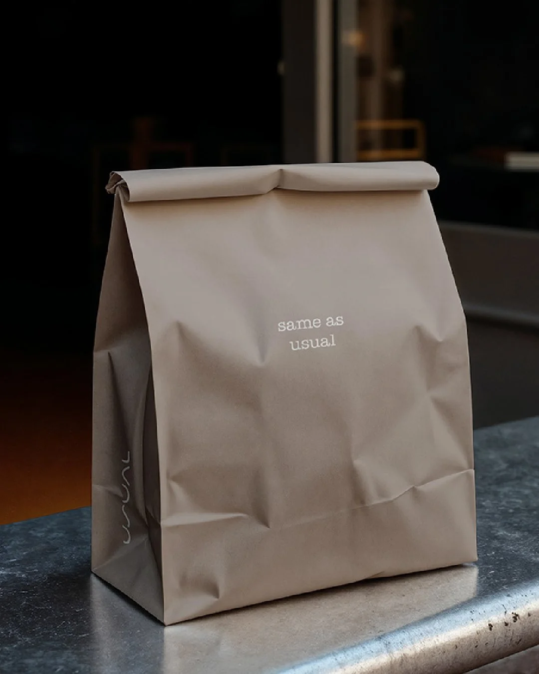
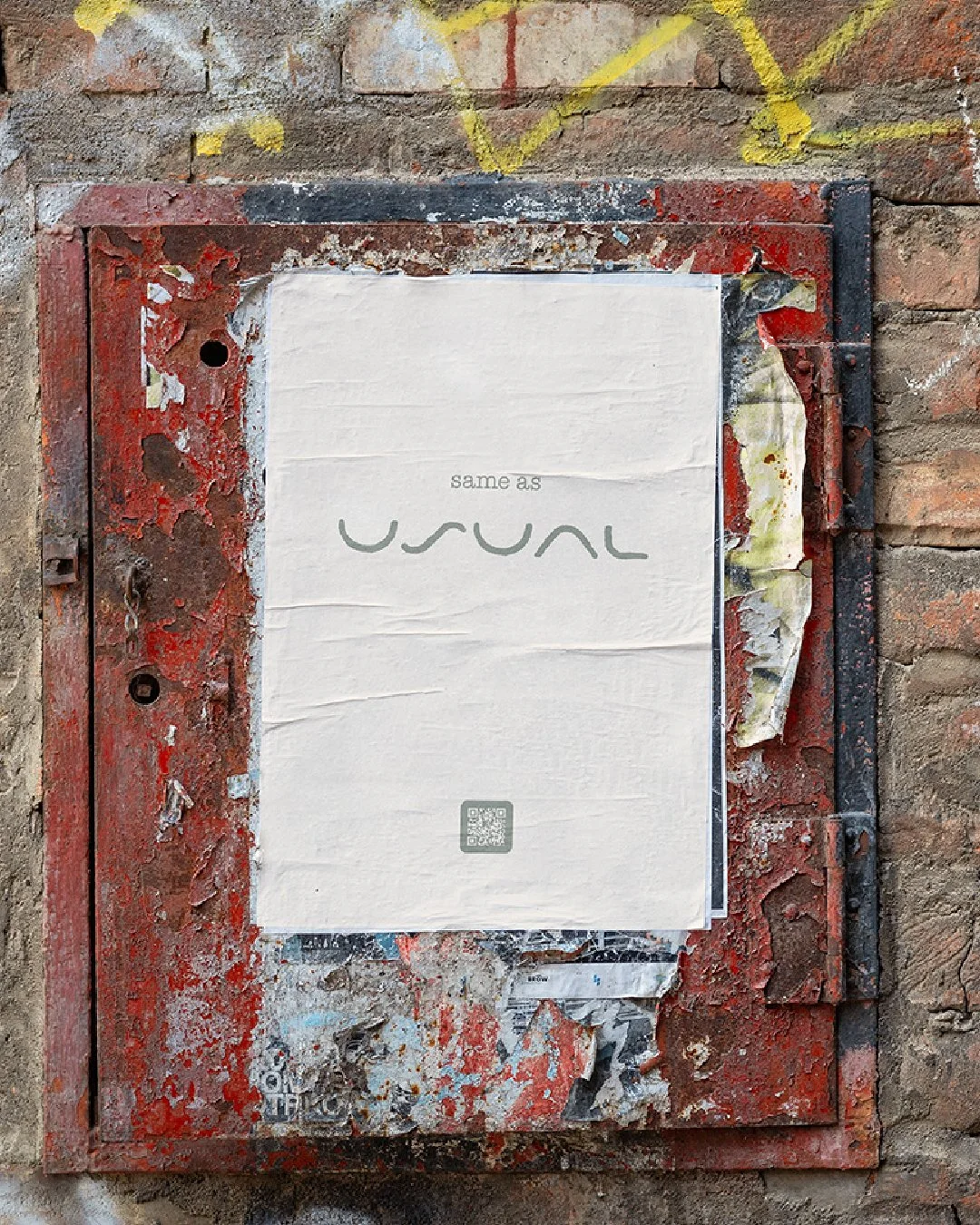
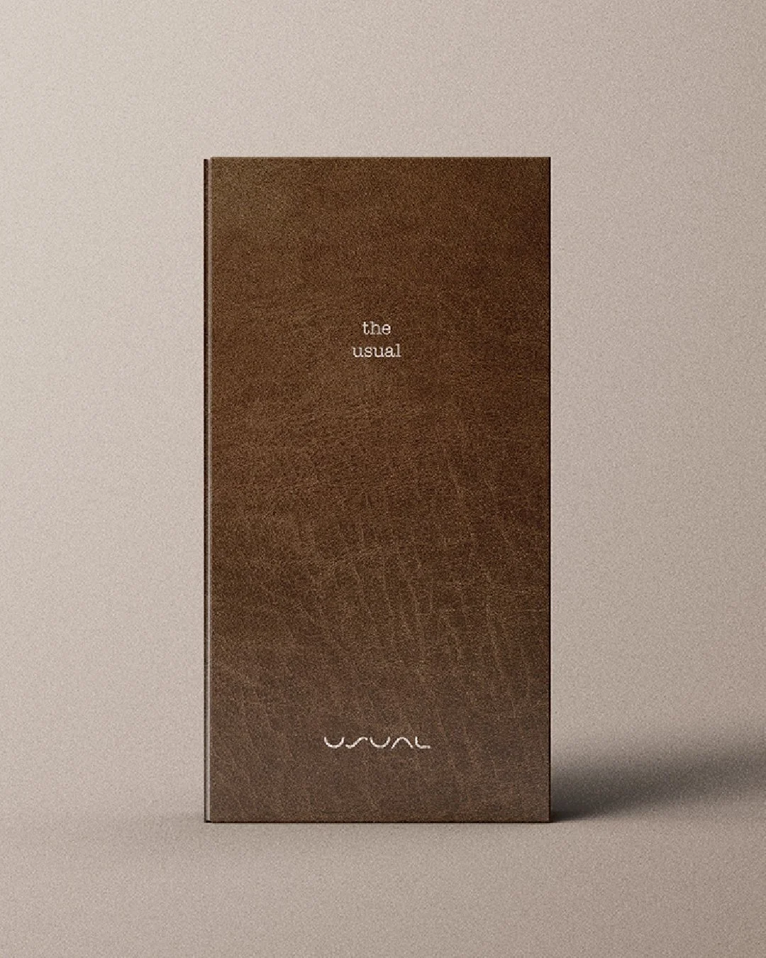
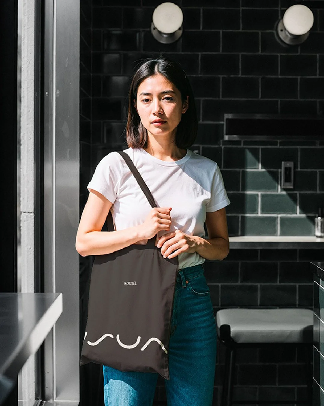
The visual system exists only to support the strategy.
Low contrast.
Calm lighting.
Restrained typography.
Familiar materials.Visual tropes associated with personality-driven café branding were deliberately avoided. No visual noise. No expressive gestures. No design that asks to be decoded or shared.
The system is built to endure repeated exposure. It is meant to disappear into use rather than compete for attention.
Nothing here is designed to excite.
Everything is designed to settle.
-
This exploration reinforced a belief that restraint is not the absence of ambition. It is a different form of responsibility.
Design decisions shape behaviour whether they are intentional or not. Choosing calm over stimulation changes how people move, choose, and return. Predictability, when treated seriously, becomes a form of care.
This way of thinking now informs how I approach real founders and brands. Not by asking how visible they want to be, but by asking what kind of relationship they want to sustain.
Restraint is not neutral.
It is a choice.
-
The Usual is a conceptual exploration.
It is not a live client, a trading business, or a tested commercial outcome. No metrics are claimed. No performance is implied.
It exists as a brand thinking artefact within Unnamed’s identity-led design practice. A way to explore how identity, language, and behaviour change when familiarity is treated as value rather than compromise.
Not every brand needs to be louder.
Some need to be more deliberate.
For designers: This exploration is available as a brief.
Download the exploration brief below. Use it as a thinking prompt. If you share your response, we’d love to see it and support your work.